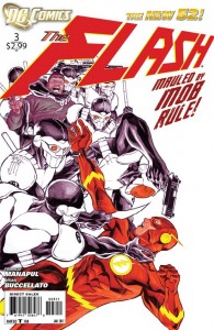
 EDITOR’S NOTE: Struck by a belt of whiskey and doused in bourbon, Crisis On Infinite Midlives editor Rob was transformed into The Spoilingest Man Alive. Tapping into the Internet device called the keyboard, he applies a tenacious sense of… ah, to hell with it. This review contains spoilers. But on the plus side, it also explains the ending of this book. You’ve been warned.
The Flash is really beginning to frustrate me. I want to like this book. The Flash is one of my favorite characters. The art by Francis Manapul and Brian Buccellato is some of the best currently appearing in monthly comics, which is no small praise when you’ve also got Jim Lee doing Justice League and J. H. Williams on Batwoman. Manapul and Buccellato are trying like hell to bring new concepts to the book. The problem is, what they need to be bringing to the book are writers.
The book opens with a spectacular title page that should make whatever Marvel intern who writes those dry, empty recap pages chop their typing fingers off in abject shame. It also contains The Flash complaining that he hates coffee, which, as a lifestyle argument, is a complete and total non-starter here in the Home Office. Sure, he says it’s because caffeine plays hell with his speed powers, but it cuts right to the core of everything I believe. Next he’ll be complaining that he can’t believe anybody likes porn because of how it leaves him chafed, bleeding and screaming. But I digress.
I’m willing to forgive the coffee slam because it actually winds up being a subtle introduction into Flash’s ability to vibrate molecules through solid objects, which is a key point relating to the airliner headed straight toward a bridge. Yeah, it’s crashing because of an electromagnetic pulse that was caused by a genetic experiment in the second issue, which makes about as much sense as showing a protoplasm flood caused by a nailgun jam, but you’ll forget all about it when you look at the art in the sequence – hell, through the entire book.
As I’ve said before, if you’re a fan of compelling comic art, you cannot go wrong with this comic. Manapul and Buccellato aren’t leaving anything on the drafting table for this book. Between the sweet title pages, the darkly-colored, subtly soft backgrounds and pencils for the general look of the book contrasted with the bright, sharp work when The Flash is using his powers, this book has a unique look that uses style to make the use of super-speed pop.
There’s a nifty two-page spread of The Flash going from one accident scene to another, where in one panel he saves a construction worker, and in the next he cages a loosed tiger… and if you stop and really look at the art, you realize that the cage is actually a fence from the earlier construction site. That is cool. It’s a nice little Easter Egg that rewards close viewing of the art in the book, and little things like that is what makes comics cool.
The problem is that the entire end sequence of the book relies on that kind of attention to detail if you want it to make any fucking sense at all.
Look: I don’t mind being challenged as a comic reader. And I’m all about diving into the details. But this particular little episode of “Where In The World Is Carmen Sandiego? Seriously: Where? Where Is That Bitch Hiding?” requires attention to details that appeared in a completely different issue of the book.
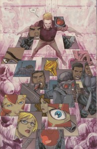
Okay, spoiler: at the end of the book, Barry Allen confronts a bunch of armed men. He pushes his compatriots out the door and slams it, then he faces his attackers and… just stands there while a bunch of images are… oh, fuck it; here it is:
 Aaaaand while he’s standing there he gets shot in the face. The end!
You see, The Flash has a power called Enhanced Cognition. He can think using the Speed Force. This should be common knowledge to the average reader since The Flash, a character with 55 years of history, has had this power since literally Day 20,042… Yeah, it was revealed during issue two last month. As was the visual cue that all those images surrounding Flash mean that he is using that power… a cue that is not repeated in this issue before it’s used here.
In fact, the only clue in this issue that The Flash can do anything like this is on page two, where he says, “I guess I’m a little A.D.D. since I learned that my brain can tap into the Speed Force.” And the only other mention of how this power works, in the second issue, shows The Flash able to think a bazillion moves ahead in any situation and get the best of all possible outcomes… which is an ability one would think you wouldn’t even need in the conclusion of this book, since no matter what combination of tactics you use, I would think they would all start with: “Move two feet. In any direction. As to avoid being shot in the fucking face.”
So what the hell happened here? Thankfully, the writers explain everything:
There’s so much information that he takes in that he freezes up. There’s just a flood of information. It’s too much for him to handle… So there are some negatives to this ability he has to process so much information, like getting shot in the head. I’d say that’s in the “con” column across from the “pros” he has in using these powers.
Ah, okay! That is a clear and concise explanation of what happened in the conclusion of the issue! That I had to read in an interview with Manapul and Buccallato on a fucking comics Web site!
Seriously: the day that this issue was released, Manapul and Buccallato sat down with Newsarama to explain what the hell was happening in their own book. And what was Manapul’s explanation for the confusion?
I think a lot of people forget that you can read the art. The art is meant to be read, you know?
…I’ve started realizing that a lot of people have grown accustomed to the process of only reading the words, and flipping through the book really quickly. But this is a visual medium. The art is meant to be read along with the words.
That’s what we’re doing in this book. Those panels are not just images on paper to razzle-dazzle you. They’re part of the narrative. It’s just that we’re using images to help move the story forward.
Which, on one hand, I wholeheartedly agree with. I love comics with not just beautiful art, but art that is intrinsic to the storytelling, and that gives you something more the more you dive into it – like the aforementioned Easter Egg. But on the other hand, art that is key to telling the story needs to be in the fucking book. And what’s more, if you’re going to use images to imply motivation, they should be consistent. Don’t use a style of image in issue two that implies a power that makes someone a tactical genius, and then use the same kind of images to imply that it makes you Rainman standing on a live electrical wire while surrounded by spilled toothpicks.
Look: if I am confused by your comic book after thirty-five years of reading this stuff? It is your fault, not mine. Particularly when the visuals I need to understand what’s happening are in another book entirely (And don’t get me started on the caption that read: “If that tank looks familiar, you’ve seen in in Captain Atom #3!” No, I haven’t. Tell me who is in the fucking tank!).
Okay, I’ve spent more words reviewing this book than were probably spent writing it. This book is beautiful. If you love spectacular comic art, then I can’t recommend it enough… but wait for the trade. Because if they’re going to force you to buy all the issues to even understand what’s going on? They clearly want you to.
 Podcast RSS Feed
 iTunes
 Google Play
 Stitcher
 TuneIn Radio
 Android
 Miro Media Player
 Comics Podcast Network