Usually news about things like “marketing trade dress” make us yawn and throw blind punches – not in any way necessarily in that order – but for good or ill, this counts as comic news: DC Comics has a new logo.
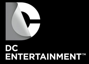
Rumors have been going around about it all week, but now it’s official: just six and a half years after the last new logo debuted, which was put in place to replace the previous one that lasted about 29 years, DC has a new look. Here it is:
Ah, that reminds me of my childhood. Because it looks like a droopy wang pointing at a roll of duct tape. Which is how I spent weekends when I was in junior high.
So what’s the impetus… I mean, what was the thought process… Um… what’s the fucking point, guys?
“What is special about DC content is the notion of a dual identity. When you think about our DC Comics superheroes, there’s a secret identity. When you think about Vertigo, it’s this notion of good vs. evil in many of the stories. And so, in addition to flexibility, the new logo communicates this idea of dual identity: There’s more than meets the eye. You have to take a closer look to understand the richness of our characters and stories.”
I took a closer look. It looks like a wang. A sad, defeated wang. And its archnemesis: a roll of fucking duct tape.
So… is that it?
Digital devices (computers, tablets, smartphones, touch-screen displays, gaming consoles) will enable users to peel back the “D” to expose a character, image, or story.
So, um… we’ll be able to touch the droopy wang. Presumably making it droopier. And expose not just the roll of duct tape, but a story. I lived that story. It’s sad and lonely.
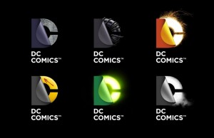
Ah fuck it; maybe it won’t be that bad. Let’s see what they have in mind:
Yup; six droopy wangs. Although to be fair, only four look like they’re drooping from isolated shame. The other two look like they’re caused by burning herpes chancres and radiation, respectively.
So what, did you whip this thing out (Heh; “Whip this thing out.”) some afternoon over a bottle of Cuervo?
Rood and Desai spent most of last year talking to the various DC and Warner Bros. divisions, and conducting focus groups of fans and specific demographics. “This was the top performing concept across all consumer segments,“ says Desai
Doesn’t look like it’s performing so well, but hey – this kind of thing sometimes happens to logos. Maybe it should just relax, have something to eat, and maybe try again in another six years. And maybe think about baseball.
DC’s New 52 comics will have this logo on their cover starting in March… although maybe now we should start calling them the New 5.2.


 Podcast RSS Feed
 iTunes
 Google Play
 Stitcher
 TuneIn Radio
 Android
 Miro Media Player
 Comics Podcast Network