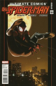
 Let’s start with the most obvious problem with Ultimate Spider-Man #3: the Kaare Andrews cover.
This cover looks like Spider-Man is trying, more successfully than most 13-year-old boys, to suck his own dick. While shooting streams of sticky goop from his general crotchal area. With his apparently gapingly spread ass shown more prominently and unobscured than his fucking head.
There are action covers, and then there are action covers, Kaare… I think Marvel picked the wrong issue of this book to hide in a polybag. Actually, I might have preferred receiving it in a lead-lined sack.
Let’s move on to the second most obvious problem with this book: More Goddamned useless widescreen visual storytelling. I’ve talked about this before, and go figure, it’s another issue of Bendis-written Ultimate Spider-Man that makes me bring it up again.
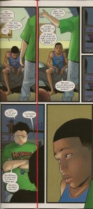
Pages two and three are delivered in a standard, read-page-one then read-page-two format. Pages three and four, however, are amongst the most egregious examples of fucking with format for no return at all I can scarely describe it.
Here: I will ruin the spine of this book on my scanner to show you what I mean:
 That red line is the binding line of pages three and four. See how the panel in the top row on page one is completely on page one, and the top row panel on page two is completely on page two? And further, see how the panel on the bottom row that does cross the page does it by maybe 3/8 of a fucking inch? That’s the only cue on these pages that you need to read all the way across the top of both pages before switching to the bottom row… and it’s on the bottom row. Which I haven’t. Fucking. Read yet!
And take a look what’s in that 3/8 of a fucking inch – click it to enlarge it if you want a better look. I’ll wait.
Bendis and Pichelli have completely broken the standard model of visual storytelling, dragging me out of the story they want to tell me by forcing me to stop and figure out how to even read the fucking thing, and for what? The spine of a math book and the back of some kid’s head. This isn’t widescreen comics, it’s just terrible visual storytelling. It’s fucking with me as a reader for the sake of fucking with me and I… won’t… have it!
*deep breath*
It might seem like I’m nitpicking, but this shit matters. Because when it comes to the story, I actually liked this book. I think it’s the best issue of the relaunched (Not rebooted! Because Marvel doesn’t reboot! They also don’t edit their freelance artists!) Ultimate Spider-Man so far… but that doesn’t matter quite so much when the first things that you notice about a comic book are that it starts weirdly homoerotic before it becomes baffling to read. That combination would sink Hamlet, let alone a pulpy funnybook about a teenaged superhero.
But since this is filed under Comic Book Reviews and not Hate-Filled Rants, I will try to salvage this screed and talk about the story. After three issues, things are finally starting to happen. We finally see some superheroics out of Spider-Man, even though he’s not Spider-Man yet. There is a spectacular sequence in the middle of the book where Miles Morales finally uses his powers for something other than impressing the fat kid in the Howard The Duck t-shirt that is genuinely thrilling, and we finally reach the point where we can see where Miles might actually take up the mantle of Spider-Man…
…but I just stopped for a minute and realized that we’re three issues and twelve bucks into this story, and only just now do we get any action. This is decompressed storytelling at it’s most decompressed, and while I’m willing to stick with it because I’m used to it and I know Bendis did the same thing with his origin arc of the Peter Parker Ultimate Spider-Man, if you’re one of the civilians who wandered into a comic store six weeks ago to check out the new black Spider-Man? Yeah, you fucked off long before you finally got some action in this issue.
When it comes to the art, Sara Pichelli continues to give us excellent facial expressions – the look she puts on Miles’ face when he realizes he just completed his first act of heroism is dead-on and full of emotion – and now that we’re finally seeing some action in this book, she’s acquitting herself admirably on that front… although once we get into tights and fights, we’ll have to see. But ultimately, how much does any of that matter when her visual storytelling is so wretched that it would make Jack Kirby put his cigar out in his eyes?
Bottom line? I hate to say it, but I can no longer recommend this book. It’s confusing, it’s building too Goddamned slowly, and it’s become too expensive a proposition, both in money and in time – considering we normally buy our comics on Wednesday night and go straight to the bar, I just don’t have the cycles for a book I need to put aside to read when I’m sober so it doesn’t confuse me.
So as much as I think it’s a habit that could kill comics, I have to advise you to wait for the trade on this one. You know, unless you have a burning need to see a comic book cover like this one’s. And if you do, make yourself known in the comments! So I know who to avoid!
 Podcast RSS Feed
 iTunes
 Google Play
 Stitcher
 TuneIn Radio
 Android
 Miro Media Player
 Comics Podcast Network